A new website design
New year, new website design. For posterity, here is a screenshot of what my
homepage looked like as of January 2, 2019:
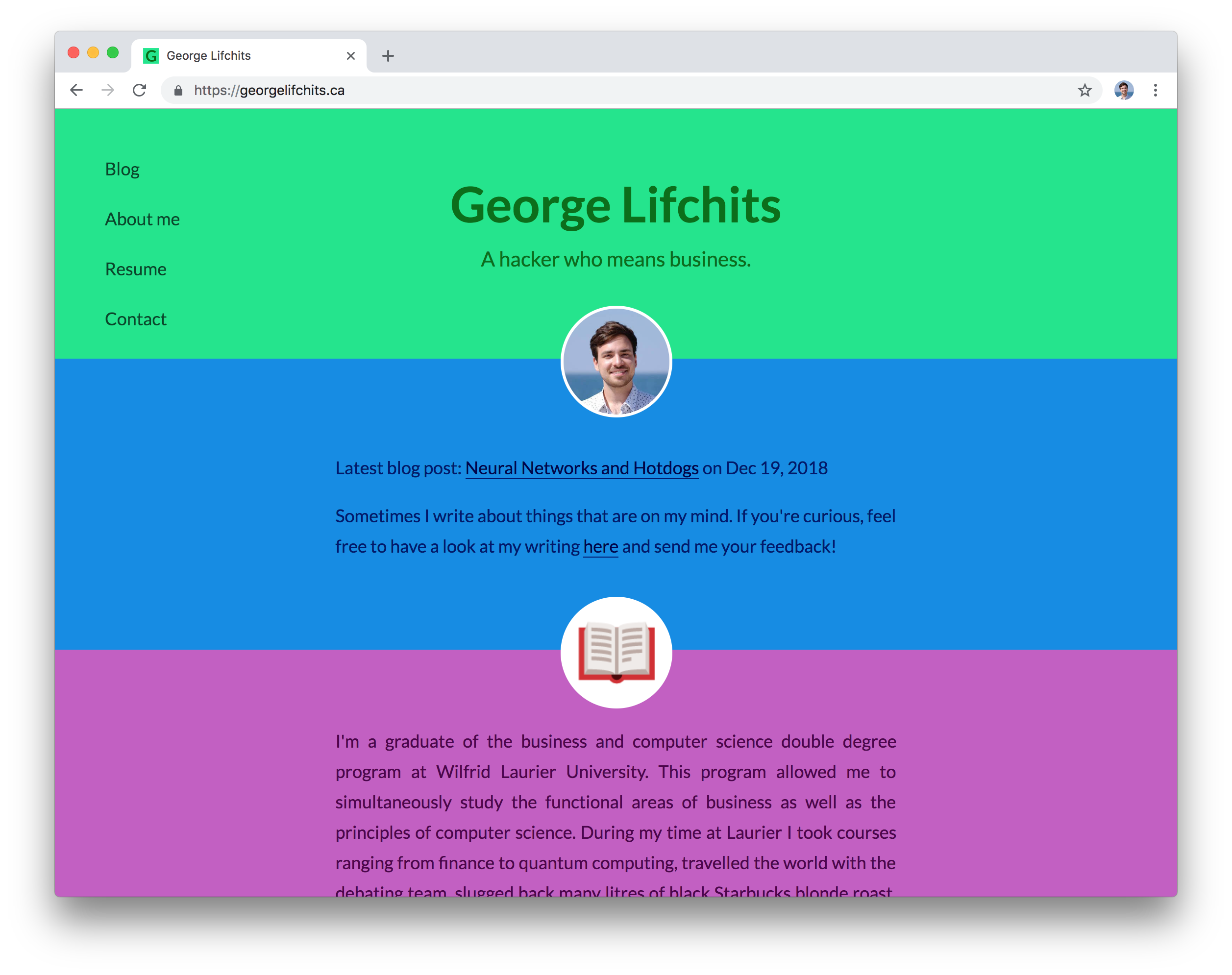
I came up with the idea of this design in 2013. I still like it, but the crazy bright colours make it kind of hard to look at on a laptop screen in public for fear of overstimulating the retinal cones and rods of those in my vicinity. Also, I’m no designer but I feel it is now dated. But I think that its minimal, content-first layout has held up generally well.
This design is way more minimal, and tragically boring to be sure, but I have been meaning to get rid of the old design for a few months now and decided to go for a really basic design and see how it feels. I didn’t use a jekyll theme so that I can easily extend this once I get inspired. But there is also a more practical reason I produced this stark creation, which is that I haven’t had the creativity to come up with an even slightly more elaborate design.
But honestly, I should say I was inspired by Tom MacWright, whose blog has a much more thoughtful but similar design, and a good post on lightweight websites. A hat tip also goes out to Brutalist Websites, and while I can’t claim to come even close to the aesthetic appeal of these websites, or claim to reject that this design tries for comfort and ease, consider the short Brutalist manifesto:
… Brutalism can be seen as a reaction by a younger generation to the lightness, optimism, and frivolity of today’s web design.
My current website is partly a reaction by my older self to the lightness, optimism, and frivolity of my previous web design! I might adopt some brutalist design elements to reduce the monotony of my design.
Finally, I should also mention that some web design inspiration has come from being in grad school, from the academic profile pages of computer science professors (exhibit A, B, C). But as motherfucking website asserts, there are benefits to the zero CSS approach (effortless responsiveness is a huge plus). And we don’t have to rely on Times New Roman: a few characters of CSS give us access to the beautifully designed system fonts of today and the improved readability of narrow columns of text.
Hoping this design serves me well! If you happen to read this post and have any opinions either way, feel free to get in touch.